The choice of fonts for websites and blogs is critical for an engaging online presence and brand building. The visual choice of a reader varies with every person but as a website or blog owner, you need to consider every aspect and web font is one such aspect.
In this article, we will see the psychology of how people perceive fonts and share a list of some recommended fonts for websites and blogs.
The Psychology behind Fonts for Websites and Blogs
Choosing the ‘perfect’ font for websites and blogs is tricky. A lot depends on readership and how you want to design the whole site. Should you use simple fonts or fancy fonts?
Let’s understand this with a research study.
Hyunjin Song and Norbet Schwartz conducted an experiment to understand the preference of people between fancy fonts and simple fonts. Two groups of people were given a set of directions. One group received directions in simple font and the other group received direction in fancy font.
The experiment revealed that it took 8.2 minutes for the people who received simple fonts to complete the set of directions whereas the other group with fancy fonts completed the same in 15.1 minutes, which is about 86% longer.
It can be understood to mean people associate with simple fonts better when they have to complete tasks as the font is easier to read and unassuming.
To make a case for fancy fonts, Hyunjin Song and Norbet Schwartz again conducted an experiment where two groups of people were given a printed menu card. As before, the menu card was printed with simple and fancy fonts and each group received one each.
The results were staggering, again. The group that received the fancy font menu assumed that the chef was highly skilled and experienced. On the other hand, the group with simple font menu assumed that the chef lacked any skills.
Clearly, the presentation of the menu impacted the people’s thinking towards the skill of the chef. The assumption is completely baseless because neither group tasted any dish made by either chef but still, this is how the psychology of people worked.
What did we learn?
If you’re selling, use of fancy fonts is recommended because people will think that more efforts went into creating the offer material, as in the case of a fancy menu. You can use fancy fonts on taglines and headings. Remember not to overdo them.
We also learn that simple fonts are best for action-oriented content. If you’re writing how-to guides, eBooks, tutorials or anything which ‘directs’ the reader to take certain actions, use simple fonts.
Now, you can’t be forever changing and adjusting website and blog fonts.
So, compare few styles of fonts and choose a mix of fonts which best substantiates your agenda.
List of 12 Best Fonts for Websites and Blogs
These are some of the top fonts we have seen on various big sites. You can combine them and start using on your blogs.
1) Oswald
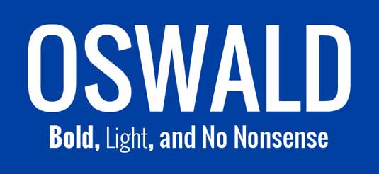
One of the first of Google Web Fonts, Oswald has better kerning and extended character sets. Vernon Adams is the font creator and the font is a reworking of classic Alternate Gothic sans-serif. The font is excellent for captions and headlines.
Check Google font here.
2) Stalemate

Jim Lynes is the creator. The Stalemate font offers an accented display and is good for displaying personal messages or announcements.
Check Google font here.
3) Gravitas One
The font is modeled on ‘UK fat face’, which was a term used during England’s industrial revolution to identify heavy advertising text. Riccardo De Franceschi is the creator. The font is recommended for titles, headers and tabs.
Check Google font here.
4) Jura
Based on the Roman Kayah Li glyphs, Jura is an alternate version created by Daniel Johnson. Later, the font included graphs from Greek and Cyrillic alphabets. The font is light and good for wide layout pages.
Check Google font here.
5) Fjord
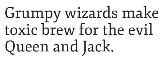
Originally used in book printing to display large content in small sizes, the Fjord is a serif-typeface and recommended for blogs and websites because we create longer content for the web. The Fjord font will offer long elegant ascenders and better modulation.
Check Google font here.
6) Amaranth
Amaranth comes with 3 styles. It has an italic upright design, with distinctive curves and contrast which is better suited for creative blogs and websites. The letters are well spaced out and makes for distinctive reading.
Check Google font here.
7) Gentium Basic
The Gentium Basic by Victor Gaultney is a combination of Greek, Latin and Cyrillic scripts. It is released under SIL Open Font License. They are free fonts but restricted with Latin character sets. The free font is good for blog content as the spacing of letters will make for interesting and engaged reading.
Check Google font here.
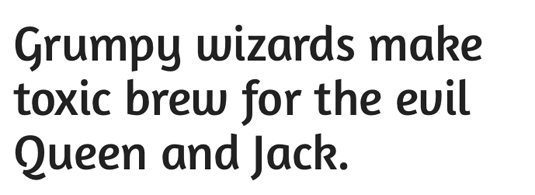
8) Arvo
Arvo is suitable for both web and print publication. It is developed by Anton Koovit. The font has uniform strokes and enhances the onscreen readability of texts. It is available in bold italic, roman bold, italic and roman slab serif.
Check Google font here.
9) Droid Sans
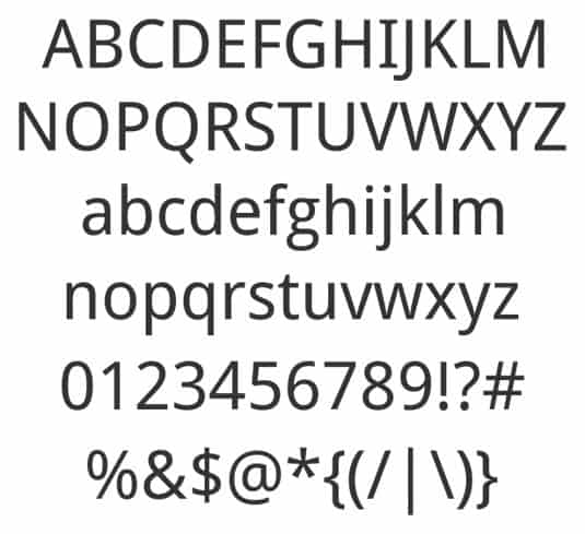
Droid Sans is a typical font focusing on digital readability. Developed by Steve Mattson, the Droid Sans is good for mobile screens. Since web readership is moving towards smartphones, the Droid Sans will be a recommend font for websites and blogs. The font looks cool and readable even in small size.
Check Google font here.
10) Vollkorn
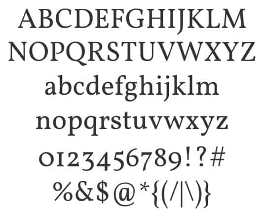
Created by Friedrich Althausen in first attempt, the Vollkorn font is a multi-purpose serif suitable for large texts, headlines and titles.
Check Google font here.
11) EB Garamond
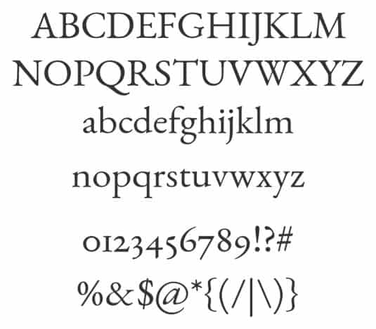
This serif font has its roots in the 16th century and is an often used font. The EB version is part of the open source project by Georg Duffner. The font gives web content a smooth layout and readers doesn’t need to have squinty eyes to read better.
Check Google font here.
12) Ubuntu

The Ubuntu is a distinctive sans-serif web font created by Dalton Maag, a London-based foundry from funding with Canonical Ltd. The web font displays beautifully on desktop and smartphone screens.
Check Google font here.
Endnote
Understand how the reader perceives your blog or website to decide a web font. If you’re just starting out, try to analyse how you want people to perceive the brand and choose a font.
You may think the choice of web fonts is a minor task when there are other important and bigger web development tasks but web fonts do impact how visitors approach your business domain.
Source: here.